Europride Amsterdam
Proudly designing for activism
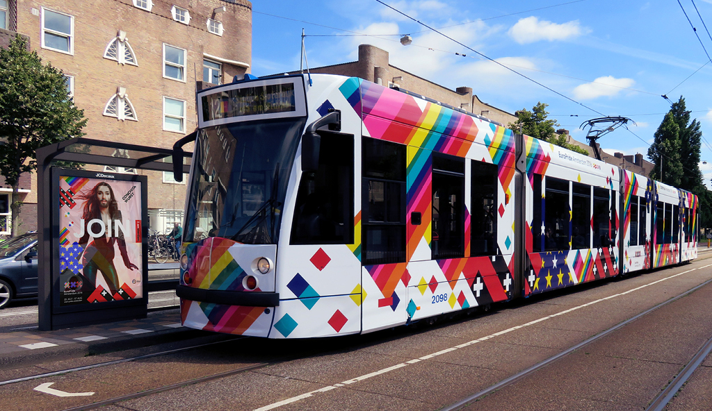
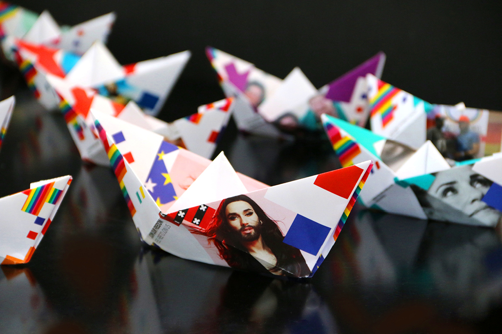
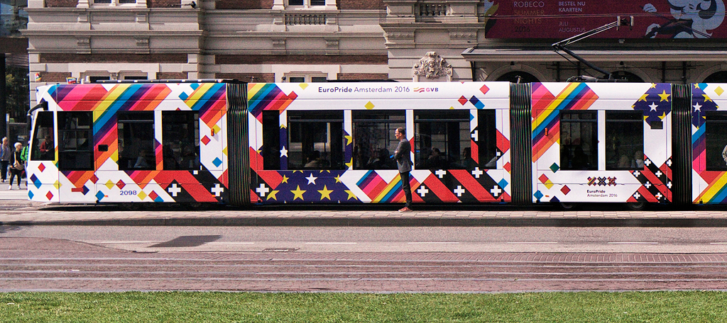
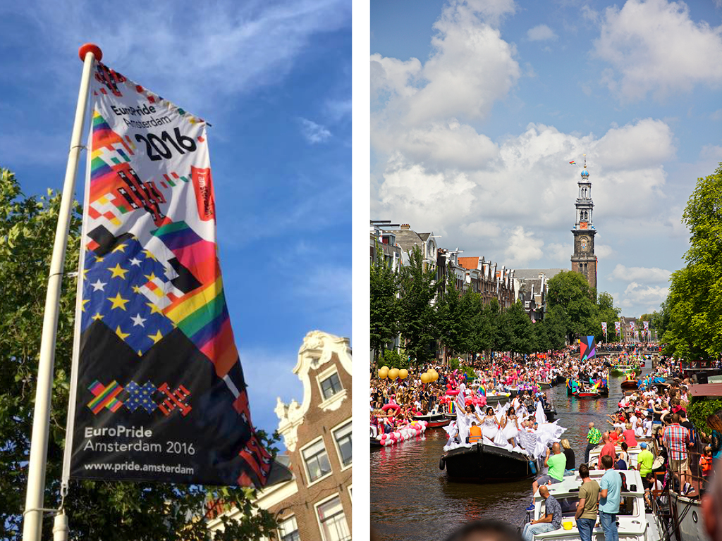
Brand Identity DesignWhilst working a VBAT, I developed a graphic language and visual identity for the Amsterdam Gay Pride Foundation in 2016. This was the year that Amsterdam hosted the Europride event. To a logo that was established at pitch phase by VBAT, I added the European flag, the LGBT pride flag and the flag of Amsterdam. With those I created a celebratory tapestry of flags and colour and a grid system to align and apply it across applications ranging from trams and buses to banners, posters, tee shirts, magazines and embroidered patches.
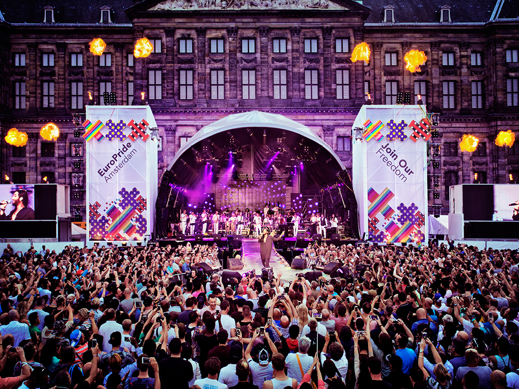
In one month, I personally donated 80 hours of my spare time to ensure the needs of the event were met.
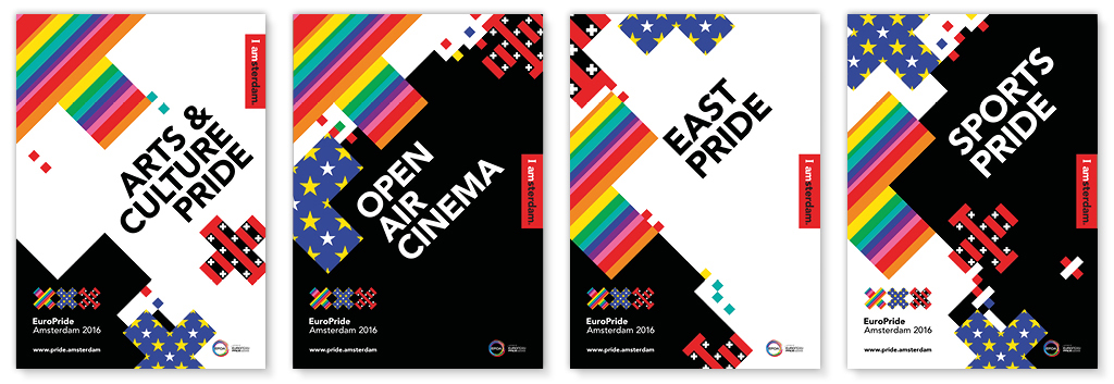
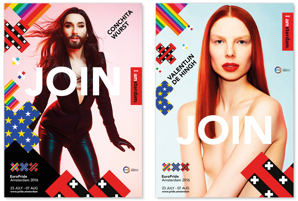
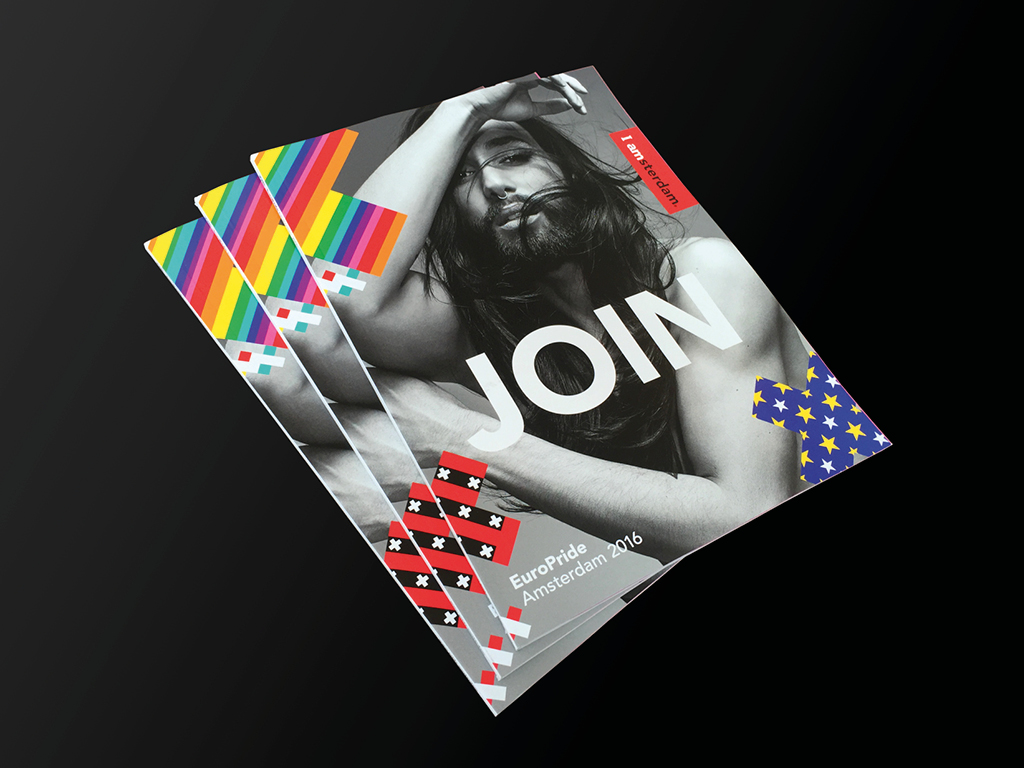
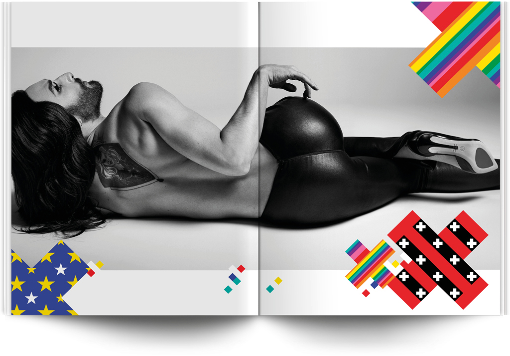
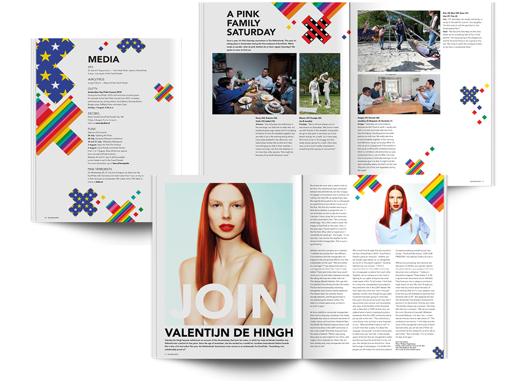
I designed and typeset a bespoke sized 122 page magazine to accompany the event. The 65,000 print run was distributed across Europe.
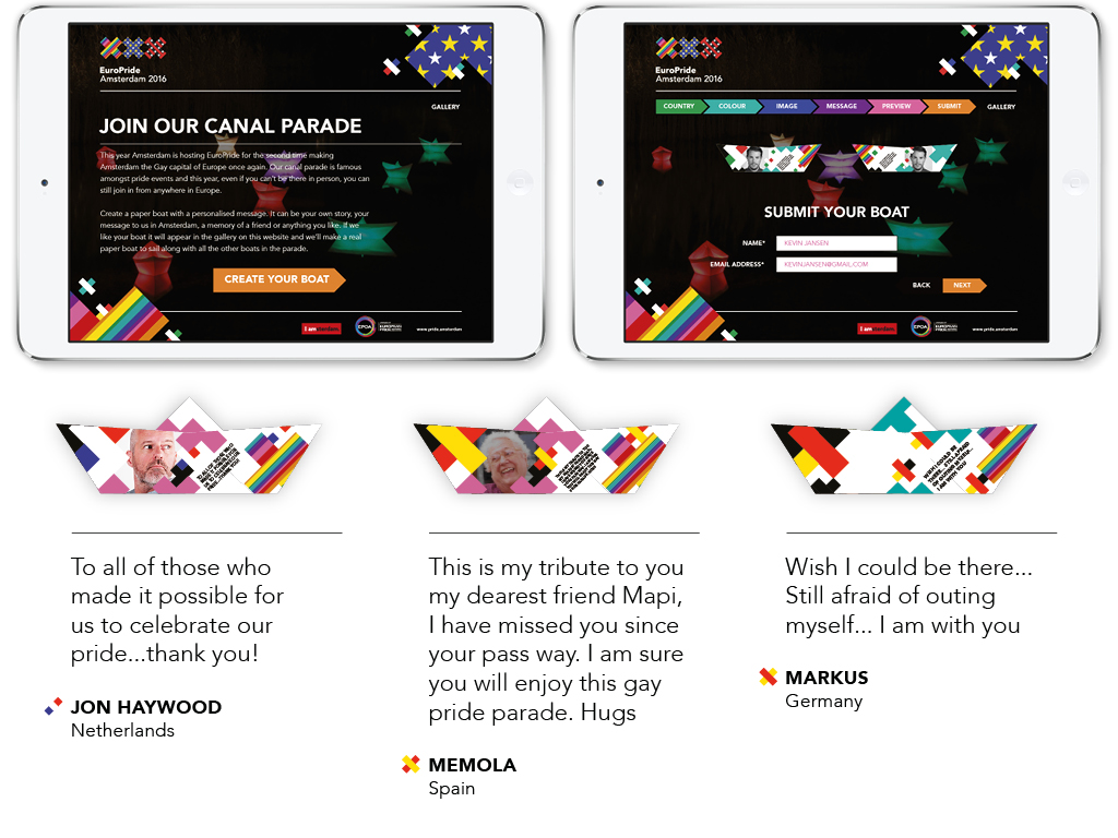
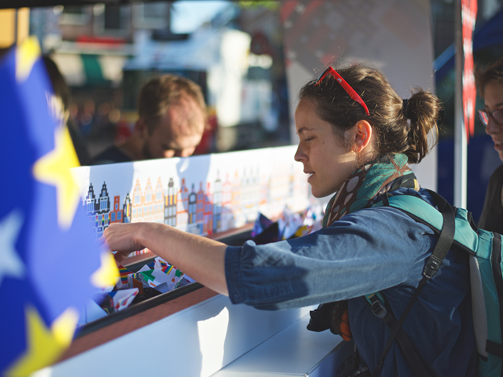
I created a website and live activation to enable those across the world who couldn’t be there in person to join in the canal parade with a custom paper boat.
Former Creative Director, Total Design
Chief Creative Officer, Superunion
Execution: Executed with attention to detail and care, so that every single execution has its own vibrant power.
Relevance: A clever combination between the playful vibrant nature of the event and the authority of the organization behind it.
Chairman, ADCN
Creative Director, INDIE
Founder, Fontsmith