Amsteldok
Building brand for WPP
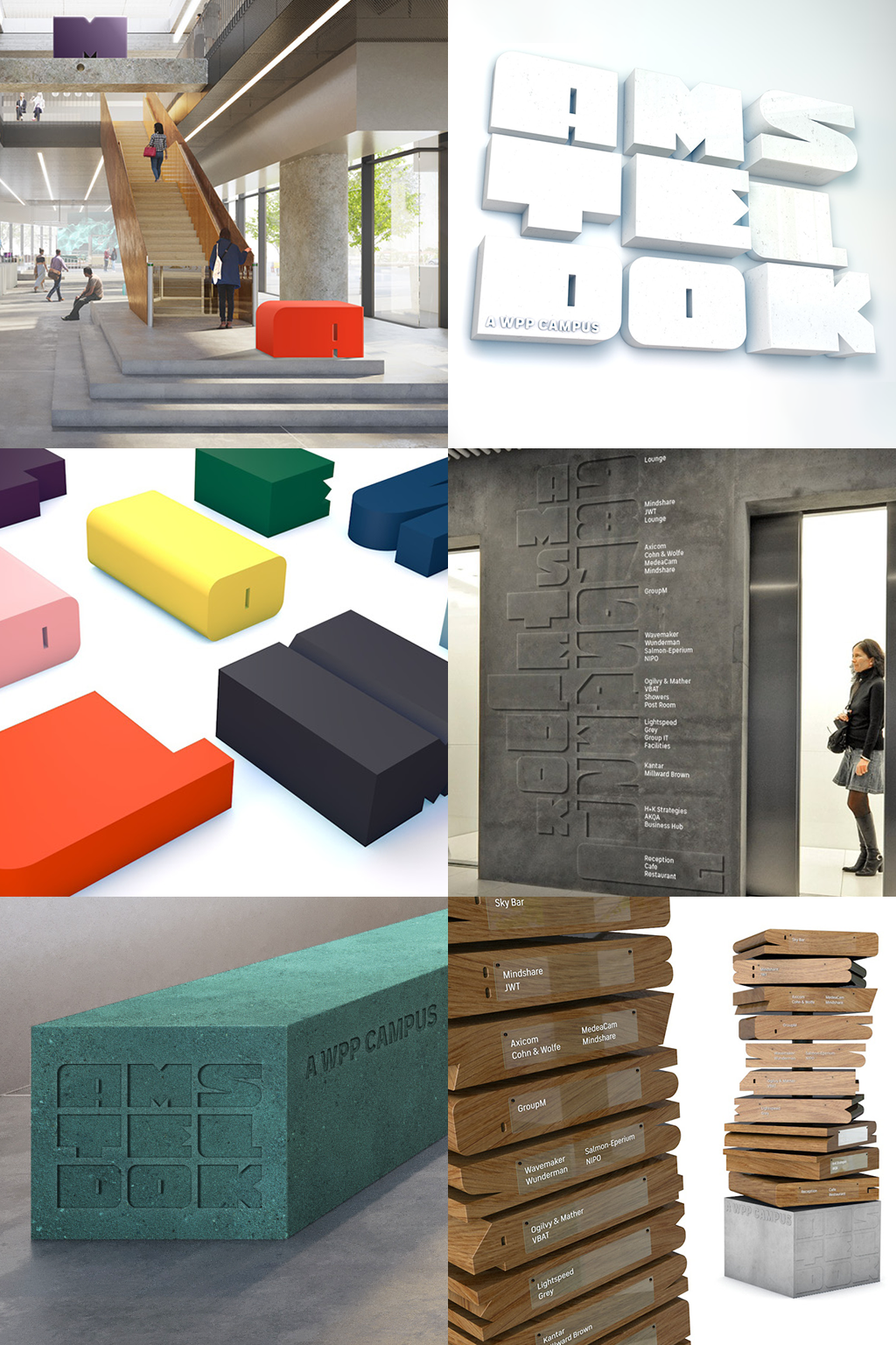
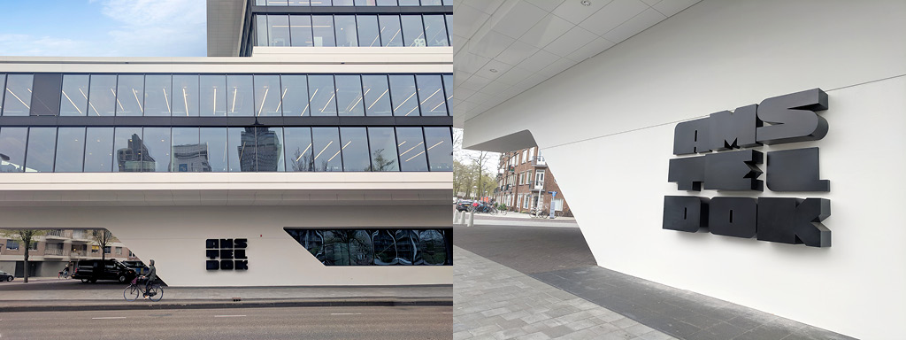
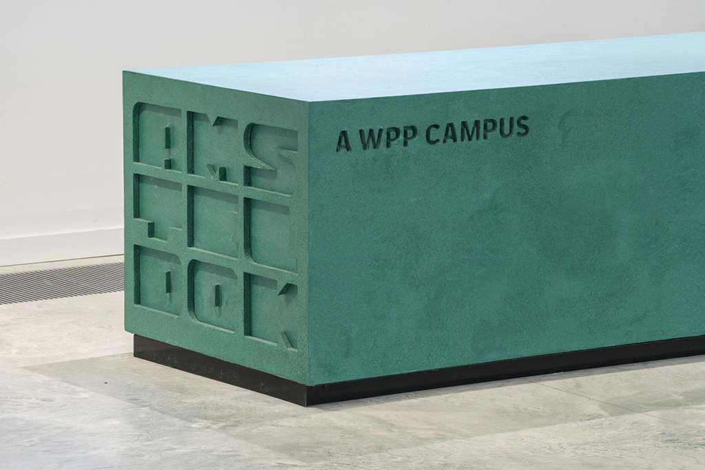
Logo, typeface and brand identity design Identity for the new WPP Campus in Amsterdam. Designed whilst at VBAT, I created a logo and typeface which take inspiration from the local vernacular in various weights and sizes which Monotype later turned into a variable font and a variable logo.
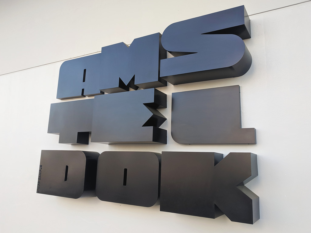
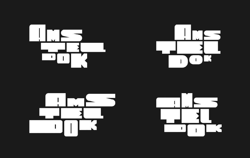
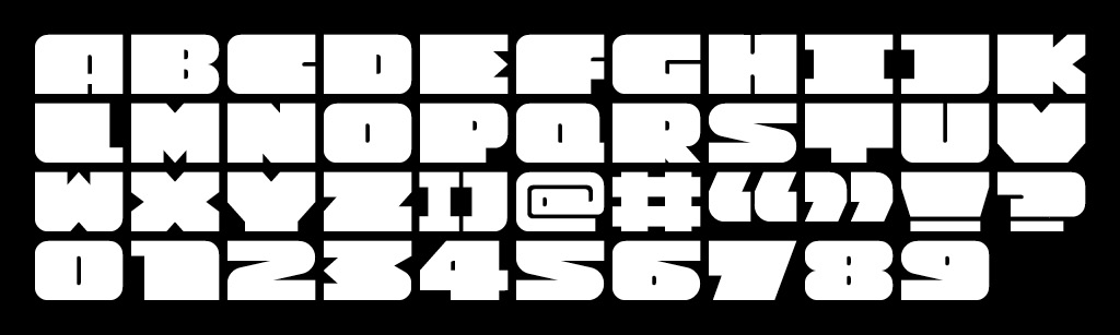
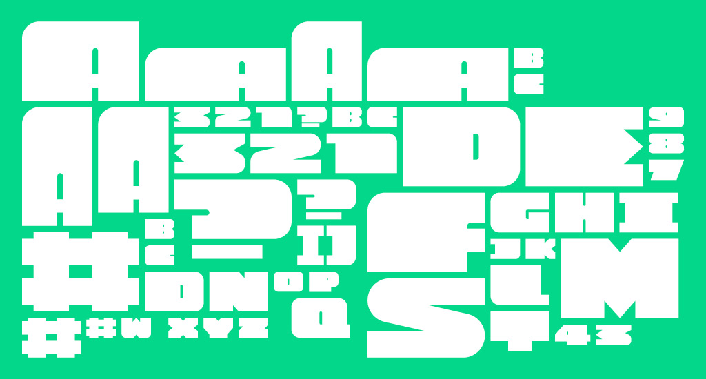
I designed a full alphabet, numerals and special characters in a number of weights and motion design for animation between the weights. This work later formed the basis for a variable typeface.
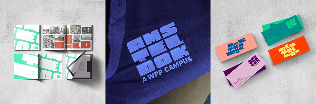
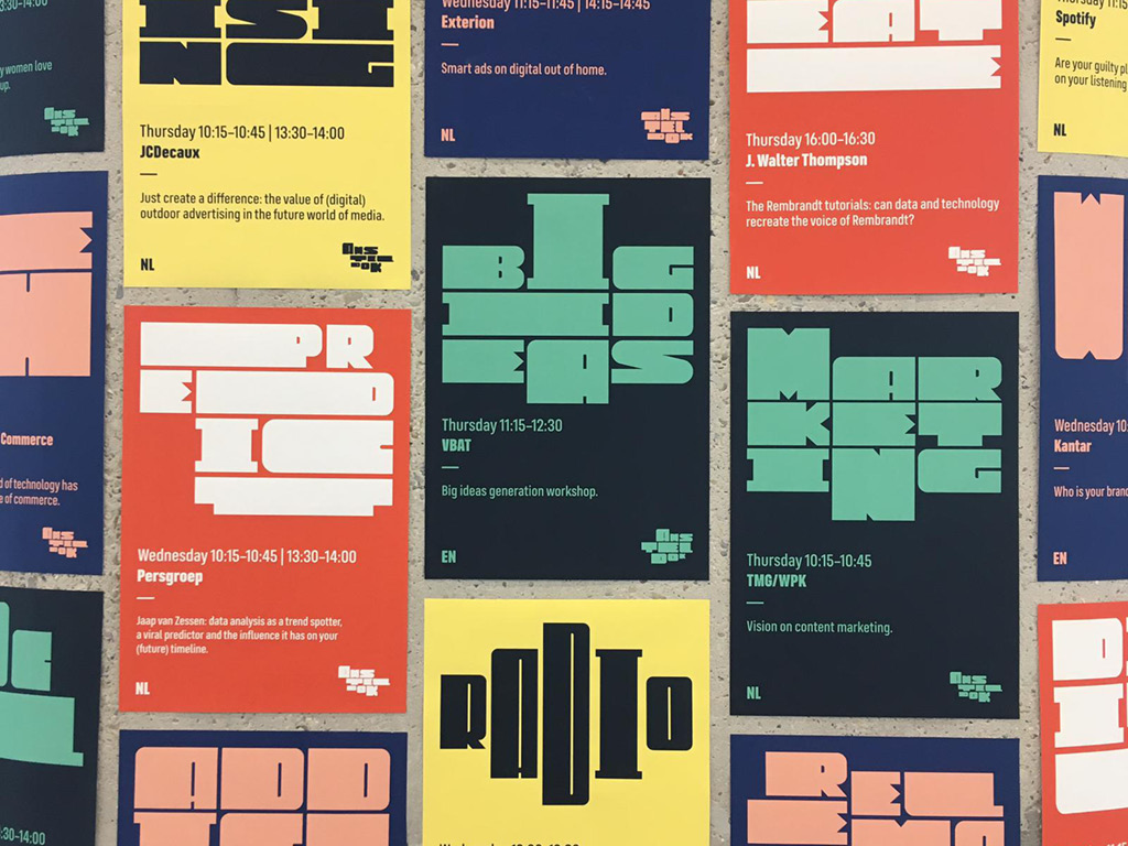
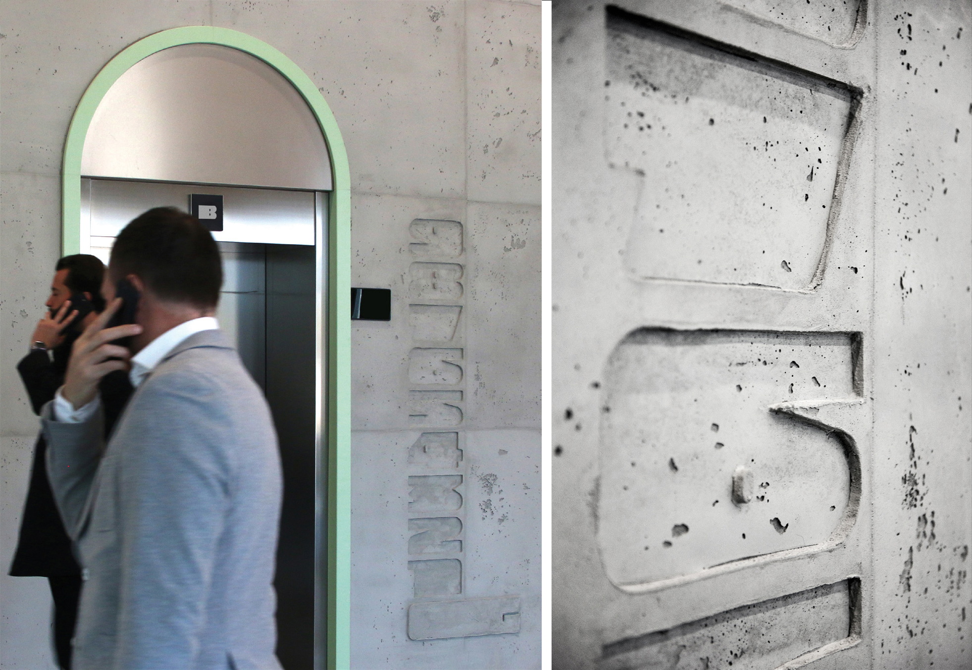
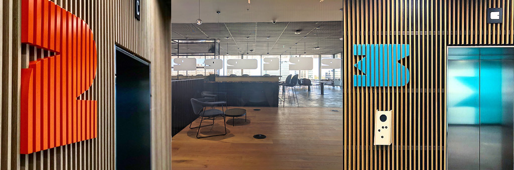
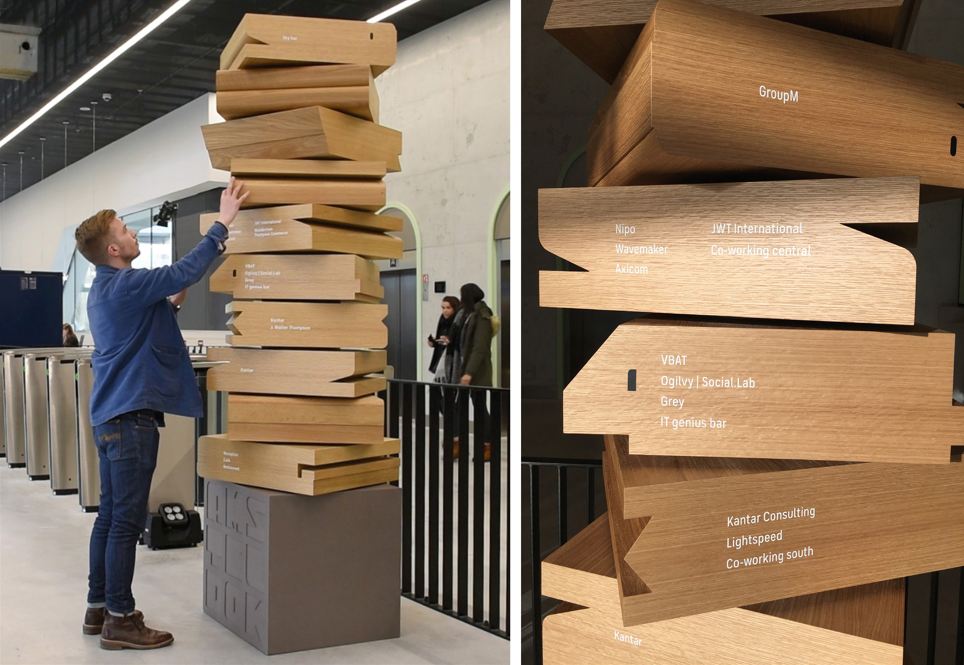
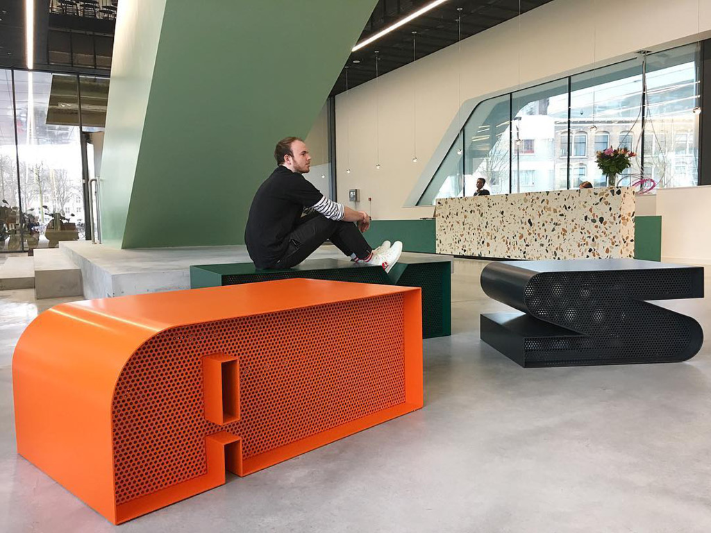
I created environmental design for the building using extrusions of the letters and numbers in three dimensions to creat furniture, embossings and moulded concrete.
The project won the following awards, among others:
D&ADs for Typography and Environmental design / Gold European Design Award for Brand Logo / Bronze ACDN Award / Silver Transform Europe Award / Communication Arts Magazine Typography Annual Award of Excellence / Bronze Eurobest Award / Bronze Clio Award / Cannes Lions nomination
Type Designer & Co-founder, Ek TypeGlobal Packaging Design Manager, Nestlé